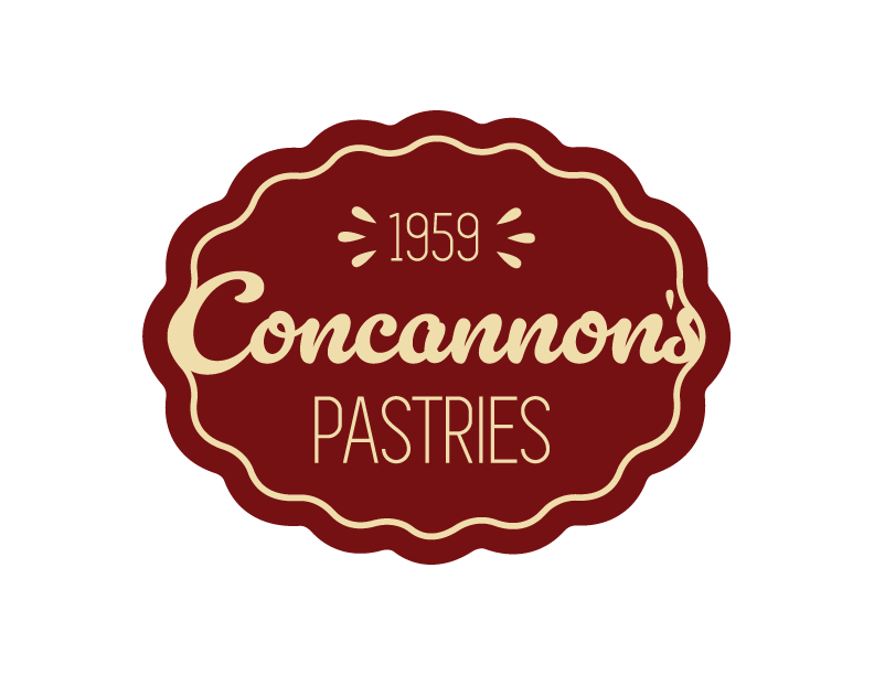
Small Business Identity
This project involved taking a local small business and redesigning its logo. I decided on Concannon’s because I have always enjoyed their pastries and thought their logo could be revamped to be easier to read. The logo takes elements and gestures of pastries without flat-out, creating an icon that involves a pastry or baker’s tool. Time after time, I see bakery logos of the same donut, cupcake, chef’s hat, rolling pin, etc. The logo’s typography for “Concannon’s”, with the varying weight and curvature, resembles how baker’s write words on a cake in icing. The other typeface is thin and long, which is a nice contrast against the script font. The curving organic shape and thin line surrounding the lettering resemble the way bakers cut the crusts of pies. The icons on either side of “1959” resemble the vent holes on a pie,
Logo Animation
This is what the logo looks like if it was animated for an online ad or TV ad.

